Artefacts
It's a Deja-Brew. All the datasets from the previous section have bean mapped into coded visuals on this page.
Pulling Beans Series
Remember the bubble charts from the Data section? Here I have converted those two geographical datasets into interactive codings. Each bean in the coded visuals below is relative to the world export/import quantities. The red bean that appears in the first visual after moving your mouse to the left, is India's 2019 export level of 6028 thousand 60 kg bags. On the other hand, the giant red bean that appears on left mouse movement in the second visual singles out Italy amongst European importers at 1063 thousand 60 kg bags. The distinction in colour on pulling out the beans clearly portrays where India and Italy stand in this coffee narrative.
1. Coffee Export 2019: India vs World
2. Indian Coffee Export in Europe 2019
Bean Bucks Series
This is a series for the line and line area graph charts from the Data section which encompassed the exact coffee export quantities and subsequent Indian farmers revenue between 2009-19. One of the main findings was that the graphs correlated with each other. Thus, the coded visuals below portray that correlation. Over time the data mapped brown beans from the first visual and the data mapped green bucks from the second visual turn into similar line patterns across the screen. This happens despite the different data types (first in coffee second in money), which means between each year starting from the top to bottom row, there are same proportional changes in the data sets.
1. India Coffee Export to Italy 2009-19
2. Indian Coffee Farmers Revenue 2009-19
Revenue Waves Series: India vs Lavazza (2019)
Last but not the least are coding visuals for the final dataset of revenue differences between Indian farmers and Lavazza. Here, I have explored the lengths of value distinctions through different means of interactions- speed and repetition.
1. Speed
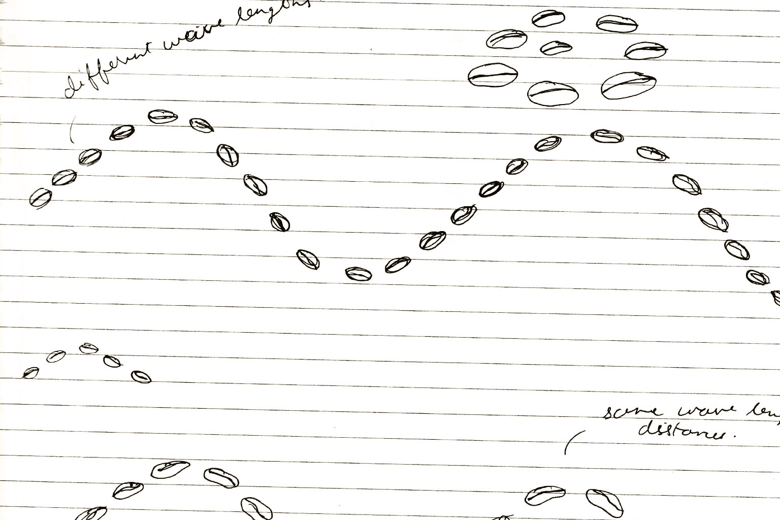
On moving the mouse across the screen, this wave's stark difference in speed is relative to the revenue difference. When the mouse is towards the left the speed is proportionate to the Coffee farmers collective revenue and rapid speed change with mouse movement towards the right is for Lavazza's revenue in 2019.
2. Repetition
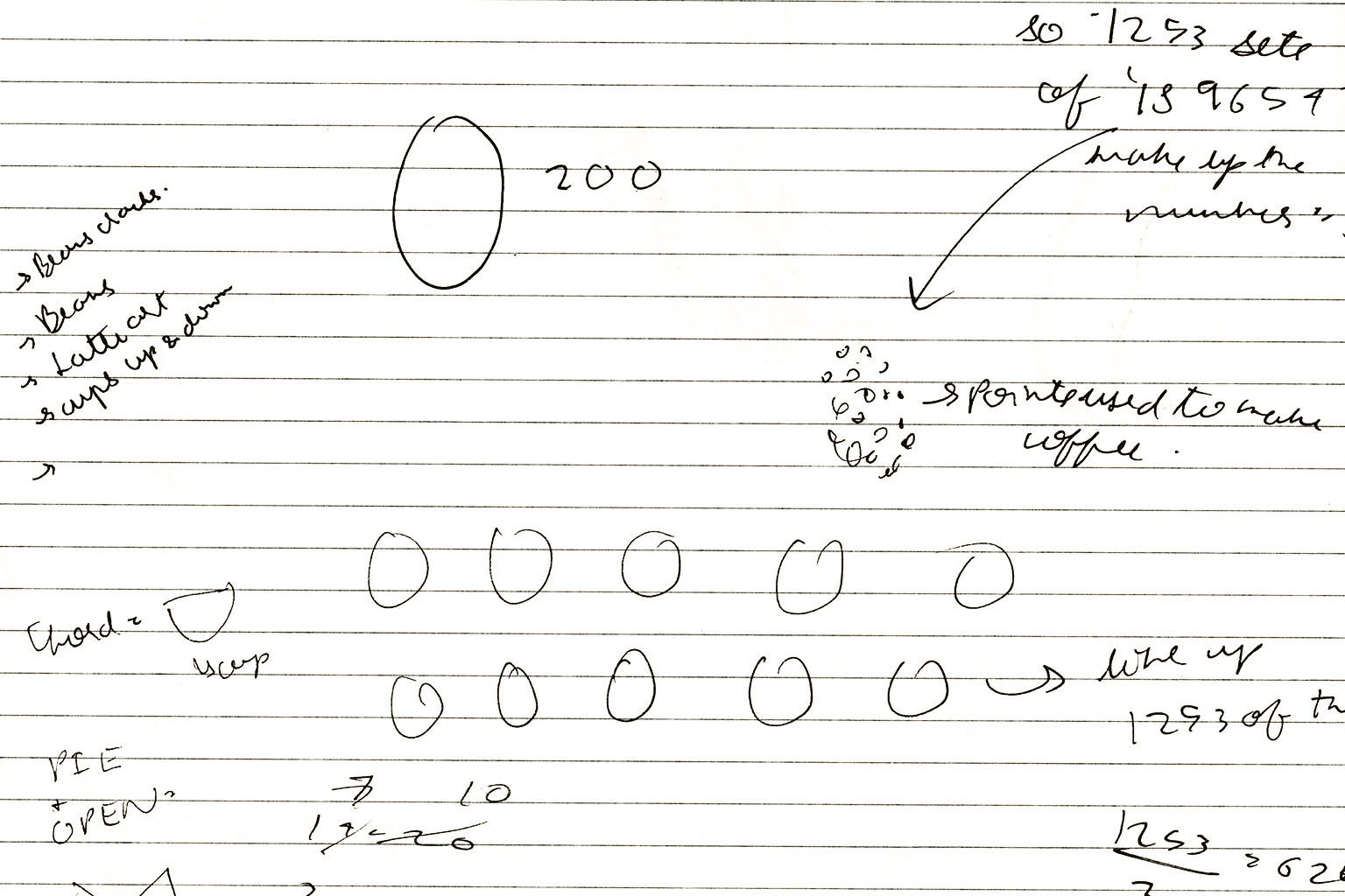
In the next three coded visuals, exactly one cup/bean represents the collective revenue of Indian farmers. Through repetition I have mapped the exact times the Indian farmers collective revenue would make up the entire revenue of Lavazza in 2019.
Glowing Revenue Beans: India vs Lavazza (2019)
While the last series portrayed revenue differences through speed and repetition, this coded visual does the same through mapping data in the sizes of the beans. For each year 2016-19 (left to right), the green bean represents the Indian farmers collective revenue and the brown beans shows Lavazza's revenue.


